Symmetry vs Usability
Balancing the aesthetic power of visual alignment with the practical demands of daily movement and ergonomic reach.

What it Means
Symmetry in interior design refers to the balanced distribution of furniture, windows, and decor along a central axis to create a formal, harmonious look. Usability, however, focuses on how people actually interact with the space—ensuring clear pathways, convenient reach zones, and functional furniture positioning. When you force a room into a perfectly symmetrical grid, you often end up with awkward clearance margins, hard-to-reach storage, or poorly placed seating that hinders daily movement.
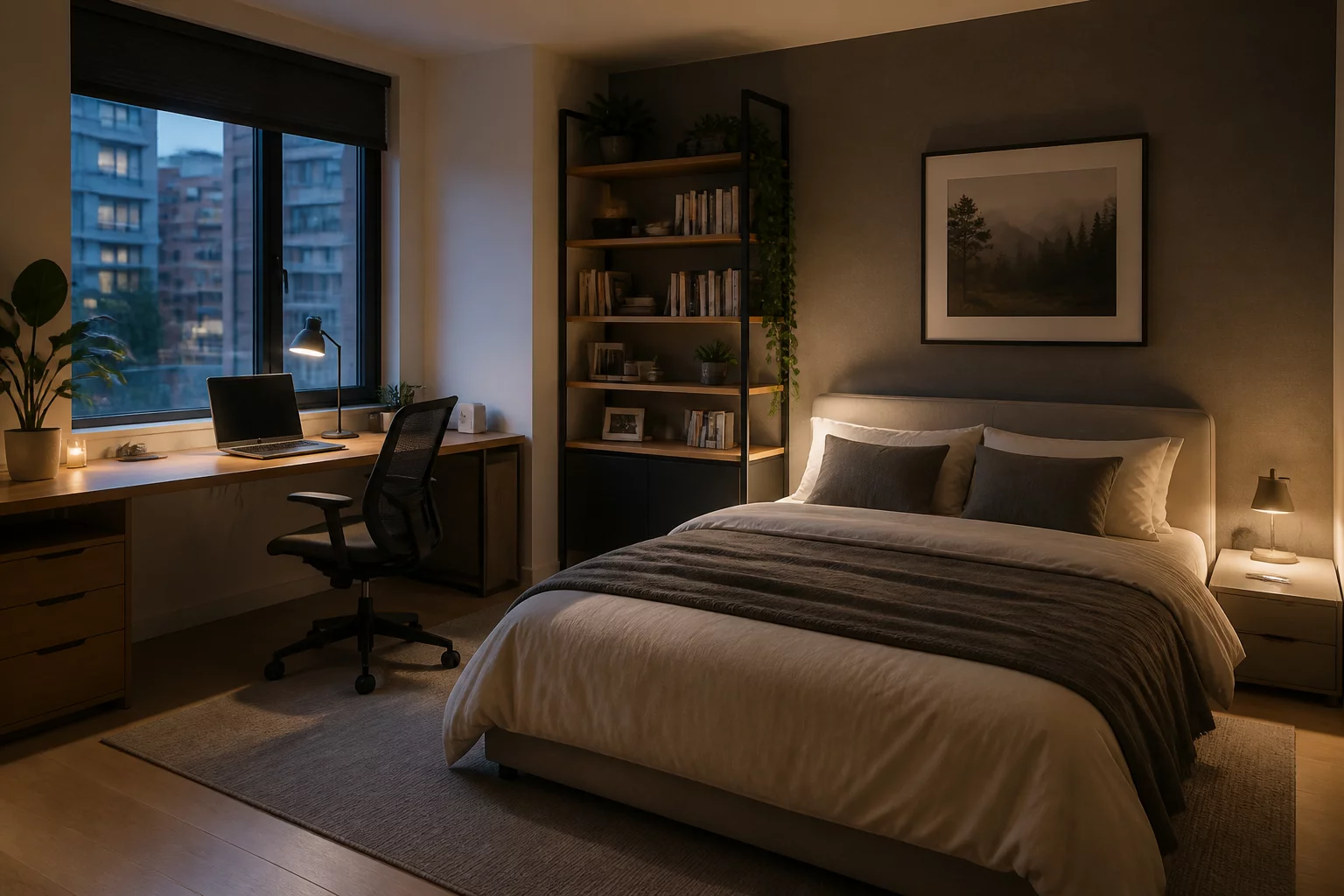
When Critical
Perfect symmetry becomes a critical priority in formal spaces where visual impression dominates, such as grand entryways, formal dining rooms, or hotel lobbies. In these environments, the psychological sense of order and prestige outweighs minor functional inconveniences. It is also important in minimalist architecture where clean lines and aligned windows dictate furniture placement to maintain architectural integrity.
Conflicts With
This index directly conflicts with daily convenience, furniture clearances, and specialized room zones. Forcing a symmetrical layout often means placing side tables where they block pathways, centering a bed in a way that minimizes desk space, or positioning lighting fixtures away from actual work areas just to align with architectural centerlines.
Example of Two Variants
Balanced Efficiency
In this layout, symmetry is compromised to maximize practical utility. The bed is pushed closer to one wall to accommodate a wider, fully functional desk near the natural light of the window. A single, larger nightstand is placed on the accessible side, leaving the tight side clear for comfortable wardrobe door clearance. This setup ensures that every daily activity has adequate clearance and access, ignoring strict centerlines in favor of user flow.
Spacious Comfort
Here, the bed is perfectly centered between two matching nightstands and flanked by identical wall sconces. While visually striking and peaceful, this arrangement restricts the size of the study desk to a narrow corner and leaves barely enough room to open the wardrobe doors on either side. The visual alignment is immaculate, but daily movement requires navigating tight squeeze points around the foot of the bed.